City Flag
What should Nixa’s new city flag look like?
Do you love Nixa? Then we want you to vote to help us select the final design of our new city flag!
Before you vote, we want you to know the history of Nixa’s past city flag designs and learn a little about best practices for flag design.
History of Nixa’s City Flags
The flag of Nixa should be a welcoming symbol which represents our entire community.
Unlike the city seal, which represents the City Council and municipal government administration, and unlike the city logo, which represents the municipal government organization as a whole (and may be worn by any city staff), a city’s flag represents the community. Anyone may use the city’s flag and fly it with pride.
Both Nixa’s previous city flag and current flag designs violated the best practices of flag design.
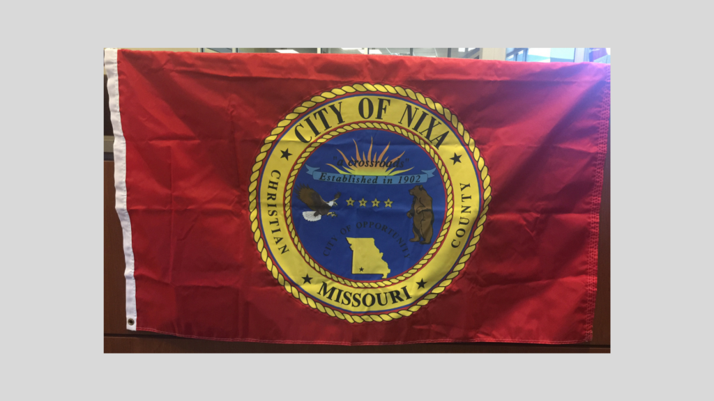
Prior to 2018, our flag included our old city seal design which included too much detail and text.
Our current flag was adopted in 2018 following a design contest in which a designer in Delaware submitted a flag with elements from our former city logo.
In 2022, the City of Nixa updated our branding including logos, colors, fonts, and other aspects of visual design and style.
 City of Nixa Brand Standards
The city is now proposing 3 finalist flag designs which integrate the city’s new brand colors and simpler logo shape.
Principles of Flag Design
According to Wikipedia, Vexillography is the art and practice of designing flags; a person who designs flags is a vexillographer. Vexillography is allied with vexillology, the scholarly study of flags, but is not synonymous with that discipline.
The North American Vexillological Association (NAVA) encourages flag designers to follow basic principles and best practices as outlined in “Good Flag, Bad Flag: How to Design a Great Flag” a quick reference book compiled by Ted Kaye based on expert wisdom of over 20 vexillographers.
 Nava.org
The Five Basic Principles of Flag Design
- Keep it simple. The flag should be so simple that a child can draw it from memory.
- Use Meaningful Symbolism. The flag’s images, colors, or patterns should relate to what it symbolizes.
- Use 2 or 3 Basic Colors. Limit the number of colors on the flag to three which contrast well and come from the standard color set.
- No Lettering or Seals. Never use writing of any kind or an organization’s seal.
- Be Distinctive or Be Related. Avoid duplicating other flags, but use similarities to show connections.
Also, consider how your design would look without wind, when the flag drapes from the upper left corner.
Design Your Own Flag
Here’s a fun activity for kids and adults alike!
- Teach your students the five basic principles of flag design.
- Show them examples of flags (you can use the link above to “Good Flag, Bad Flag”)
- Print off copies of the PDF below, which is a template you can draw your own flag designs on.
- Let your imagination run wild, or try to abide by the best practices. What does your flag design mean to you? You are now a vexillographer.
Proposed Flag Designs:
Nixa City Council selected the 3 finalist designs from among various potential designs developed through a collaboration of the city’s communications department with a local graphic design consultant. Following the public vote, City Council will then vote to officially adopt our new flag design.
Option 1:
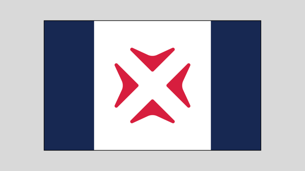
Meaning and Interpretation:
First, you will notice this design is in red, white and blue, harkening to the colors of our national flag. Red and blue also have unique meaning for Nixa.
“Nixa Red” reminds the viewer of red Azaleas, our official city flower, and represents our passionate commitment to an exceptional quality of life and public service.
“Innovation Blue” represents strength, peace, responsibility, wisdom, truth and trustworthiness.
The two parallel bars in “Innovation Blue” represent the James and Finley rivers, between which Nixa is located.
The four converging arrows in “Nixa Red” represent the place which attracts people from all around to make their home. An X in the negative space between those converging arrows marks the spot where you may find that which you treasure most. Historically, the X in the name of our city has symbolized a crossroads, it has also come to signify a multiplier of opportunity. The people of Nixa are the intangible X factor of our community. They are our town’s greatest asset. Our potential for forward progress comes from their vision and determination.
The white background represents the opportunity anyone has in Nixa to pursue life, liberty, and happiness. It also represents their opportunity to shape our community’s future, a proverbial “blank slate”.
Pros and Cons of this Design:
- This design is intended to follow the 5 principles of good flag design.
- The design is symmetrical left to right and top to bottom.
Option 2:
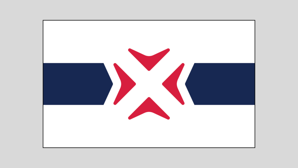
Meaning and Interpretation:
First, you will notice this design is in red, white and blue, harkening to the colors of our national flag. Red and blue also have unique meaning for Nixa.
“Nixa Red” reminds the viewer of red Azaleas, our official city flower, and represents our passionate commitment to an exceptional quality of life and public service.
“Innovation Blue” represents strength, peace, responsibility, wisdom, truth and trustworthiness.
The horizontal bars on either side of the city logo shape represent the arrows of time. The left arrow points to the future, where our community is heading. The right blue arrow points to our past, which roots us in our history and informs our present. Nixa is the place in between the future and the past, right here in the present.
The four converging arrows in “Nixa Red” represent the place which attracts people from all around to make their home. An X in the negative space between those converging arrows marks the spot where you may find that which you treasure most. Historically, the X in the name of our city has symbolized a crossroads, it has also come to signify a multiplier of opportunity. The people of Nixa are the intangible X factor of our community. They are our town’s greatest asset. Our potential for forward progress comes from their vision and determination.
The white background represents the opportunity anyone has in Nixa to pursue life, liberty, and happiness. It also represents their opportunity to shape our community’s future, a proverbial “blank slate”.
Pros and Cons of this Design:
- This design is intended to follow the 5 principles of good flag design.
- The design is symmetrical left to right and top to bottom.
- When there is no wind, causing the flag to drape, the white canton (upper left corner) and lower right corner may be the only visible parts of the flag. Since both these areas are white, it may resemble the white flag of surrender.
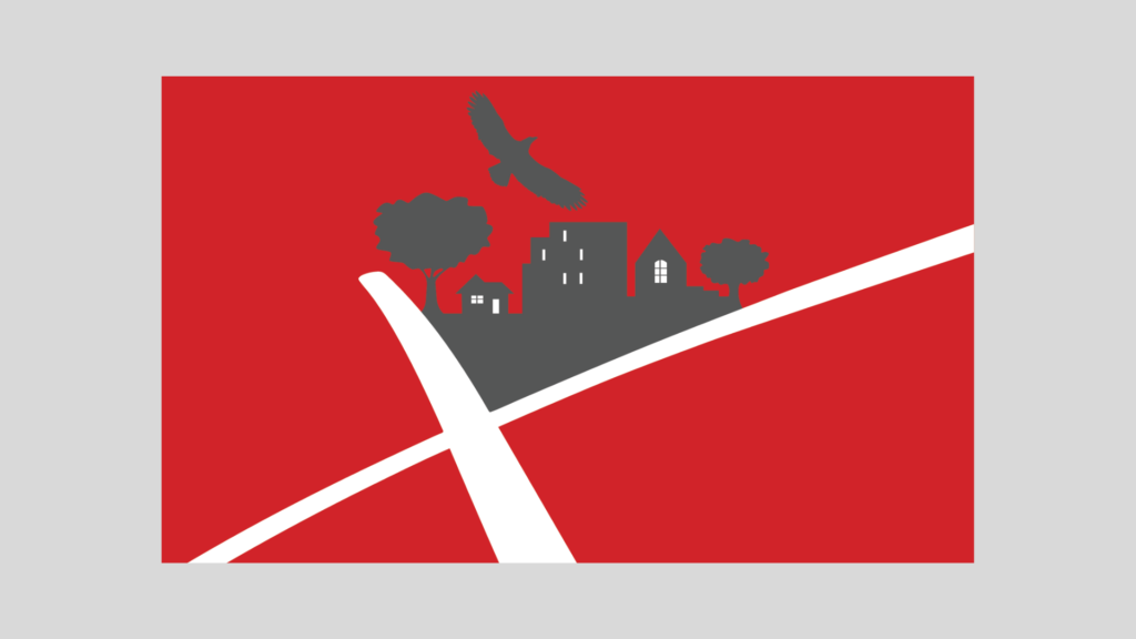
Option 3:
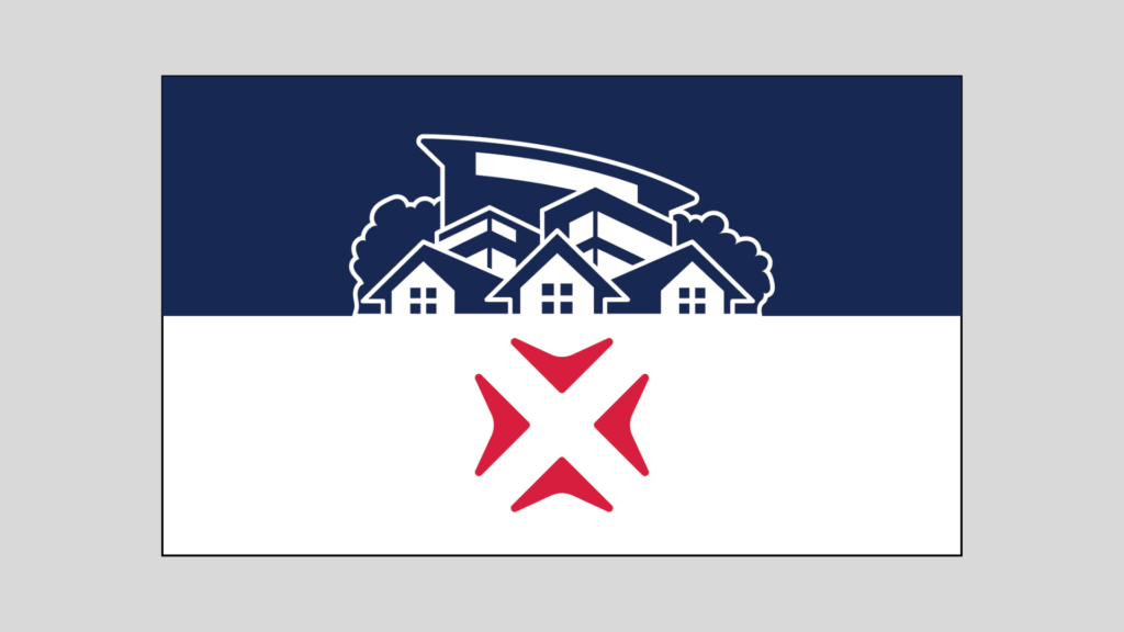
Meaning and Interpretation:
First, you will notice this design is in red, white and blue, harkening to the colors of our national flag. Red and blue also have unique meaning for Nixa.
“Nixa Red” reminds the viewer of red Azaleas, our official city flower, and represents our passionate commitment to an exceptional quality of life and public service.
“Innovation Blue” represents strength, peace, responsibility, wisdom, truth and trustworthiness.
The city silhouette represents homes in the foreground (as Nixa is primarily a residential community), with businesses behind the homes, and behind those, a representation of Nixa City Hall, which symbolizes the municipal government’s role in supporting both residents and businesses.
The four converging arrows in “Nixa Red” represent the place which attracts people from all around to make their home. An X in the negative space between those converging arrows marks the spot where you may find that which you treasure most. Historically, the X in the name of our city has symbolized a crossroads, it has also come to signify a multiplier of opportunity. The people of Nixa are the intangible X factor of our community. They are our town’s greatest asset. Our potential for forward progress comes from their vision and determination.
The white background represents the opportunity anyone has in Nixa to pursue life, liberty, and happiness. It also represents their opportunity to shape our community’s future, a proverbial “blank slate”.
Pros and Cons of this Design:
- The design is NOT symmetrical left to right nor top to bottom.
- This design includes both the city’s new logo (four red arrows pointing inwards to x in the negative space) and another symbol from our brand kit, the city “silhouette”, which also features in the city seal.
- The silhouette design may be too complex to be drawn from memory.